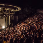
One of the most striking events of the winter season on London’s design scene, the Harland Miller exhibition, has only three days left. Opened on 10 December, this free showcase puts the spotlight on the monumental paintings of one of the most important figures in international contemporary art, while closely examining his deep-rooted relationship with graphic design discipline.
If you love the power of typography, saturated colour palettes, and the transformation of words into visual objects, this is your last chance not to miss an exhibition that closes on 25 January.
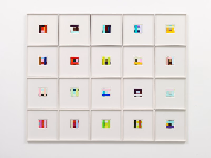
Letter Paintings: A Bridge from the Middle Ages to Pop Art
The core focus of the exhibition is Harland Miller’s “Letter Paintings” series, which draws nourishment from his fascination with medieval illuminated manuscripts—discovered during his student years. Miller merges the meticulous labour medieval monks devoted to embellishing religious texts with the oversized billboard aesthetics of the modern advertising world, bringing the sacred and the everyday together on the same canvas.
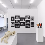
Using custom-designed typefaces of his own creation, the artist transforms words into physical masses through bright, saturated colour gradients. The exhibition’s division into two distinct areas allows visitors to see both the “kitchen” of this process and its finished monumental form:
- Huth Gallery (Level 2): Large-scale oil paintings inspired by the giant billboards of Los Angeles freeways.
- Mezzanine (Atrium): Sketches and studies on paper that offer clues to the structural composition of the large paintings.
Highlights of the Exhibition
In Miller’s art, graphic design is never merely a tool; it is a language of expression. Several works in the show push the boundaries of that language:
- Far Out (2022): The artist’s first diptych in this series. Monumental letters appear to compete with one another within rich colour palettes, almost spilling beyond the edges of the canvas.
- XXX (2025): Completed just before the turn of 2026, this new work is one of the most provocative pieces in the exhibition—both for its formal aesthetics and for its references to punk culture and “X-rated” cinema.
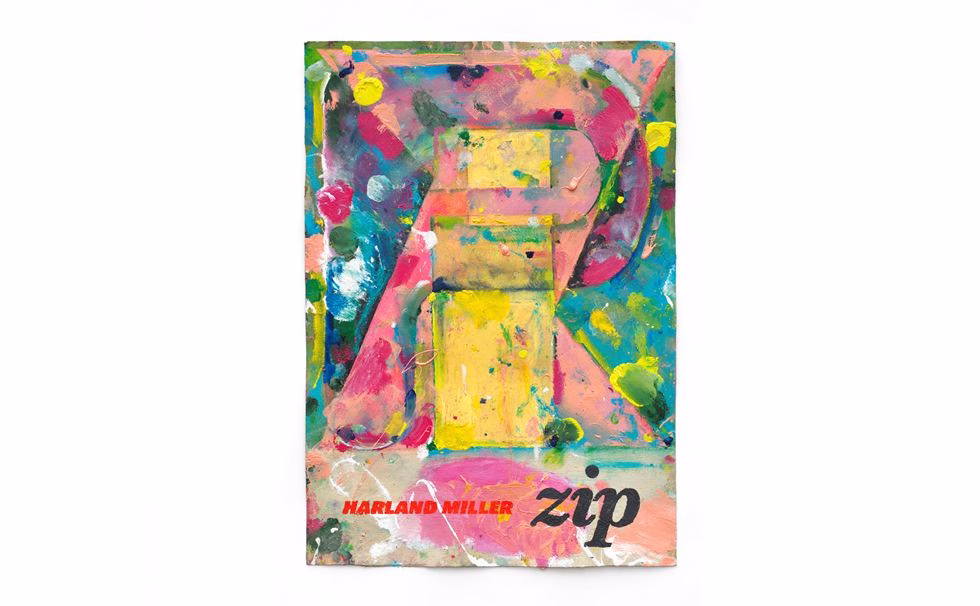
- If, Boss, Zip: Other key works that emphasize the contrast between the brevity of words and the visual weight they create.
Co-curated by Design Museum director Tim Marlow alongside Harland Miller himself, the exhibition demonstrates how graphic design can evolve beyond being a “museum object” into a genuine discipline of fine art.
Photo © White Cube (Theo Christelis)